The 15 Best Paint Colors for Your Living Room
:max_bytes(150000):strip_icc()/JeanneBarber-9bd8db03cf6f434cbeab72b65b612837.jpg)
From entertaining guests to winding down after a long day, the living room serves many functions. So, naturally, choosing a beautiful, versatile paint color for this space is absolutely crucial.
However, finding the right hue isn’t as easy as it sounds. Not only are there seemingly endless tints of white alone, but you also have to consider the ambience that you’re going for, as well as how your chosen color will pair with the rest of your home.
To help make the decision process less overwhelming, we consulted with interior designers about their favorite living room paint colors. Scroll on for some of their top-tier suggestions.
Whitehall by Mylands
Jet Hruby
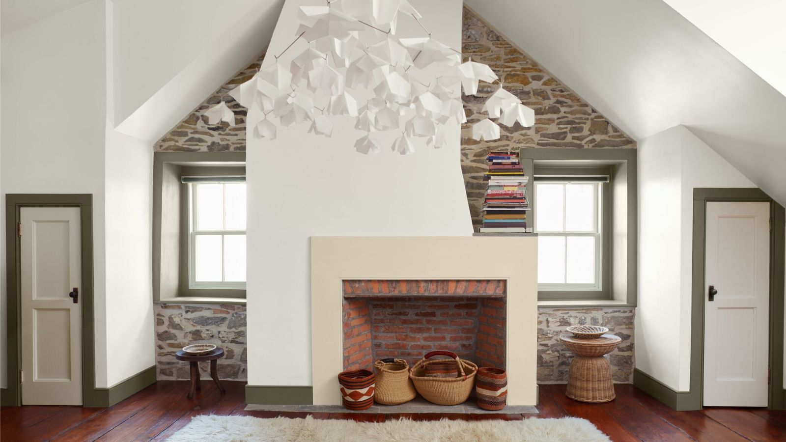
When in doubt, stick with neutrals. “I find that bold or overly vibrant colors can feel overwhelming in a living space, which is why I focus on tones that promote calm and balance,” says Jet Hruby, designer at Hruby Interiors.
“One of my favorite shades is Whitehall. It’s a beautifully soft white that brings warmth to the space, while maintaining a bright, airy feel.”
Green Smoke by Farrow & Ball
Minnette Jackson Interiors
Looking for something that’ll make a statement without going over the top? Go green.
“It’s cozy, yet elegant,” says interior designer Minette Jackson of Green Smoke. “During the day, it feels luxuriously rich, but still offers an organic element. At night, it envelops you in a moody and sophisticated retreat.”
Ballet White by Benjamin Moore
Minnette Jackson Interiors
Does your living room get lots of natural light? Amplify its brightness with a soft white.
“If you’re looking for a neutral color that can act as a backdrop for elegant furnishings, soft colors, and a mix of art, then try Ballet White,” says Jackson. “It’s a lovely foundation that looks wonderful in a light-filled room, and allows gracious furnishings to stand out.”
White Dove by Benjamin Moore
A crisp white freshens things up and brings in elevated sophistication, like in this living room by interior designer Suzanne Kasler.
“White Dove plays off the classical trim and limestone floor in an effortless way, and invites light to dance throughout the space,” she says. “It makes the entry feel both expansive and welcoming, and sets a serene tone that flows seamlessly to the rest of the house.”
Classic Gray by Benjamin Moore
Greige is a combination of white and gray that’s just right, and looks lovely in living rooms.
“It’s elegant without feeling too formal, and subtle without being dull,” says interior designer Vanessa DeLeon. “It creates a serene and inviting atmosphere thanks to its warm undertones and high light reflectance.”
Cotton Balls by Benjamin Moore
Cotton Balls is another classic white that creates a perfect blank canvas for your living room.
“It’s a crisp and soft hue that reflects natural light beautifully, creating a luminous backdrop for the bookshelves and our client’s striking art collection,” says interior designer Lara Apelian.
Wickham Gray by Benjamin Moore
A soft, subtle gray is a wonderful neutral that serves as a versatile background for a living room.
“Wickham Gray’s soft blue undertones bring a serene, fresh energy to this space,” says Mike Rupp, principal of Rupp Studio. “It feels calm and elevated, and plays nicely with layered textures, tonal fabrics, and just about any style of furniture.”
Setting Plaster by Farrow & Ball
Like white, pale pinks can be extremely versatile—but they add a touch more warmth and personality than other neutrals.
“If you’re thinking about painting your walls white, think outside the box,” says Jeanne Barber, lead designer and principal of Camden Grace Interiors. “Setting Plaster offers the same warmth, but adds a bit of nuance.”
Acadia White by Benjamin Moore
Lifeless, sterile white paints are out, and creamy, off-whites are in.
“I used this versatile shade because it has a subtle warmth that prevents spaces from feeling too stark, while still maintaining a bright and airy atmosphere,” says designer Megan Evans. “This color pairs well with various décor styles, complementing both cool and warm color schemes.”
Ballroom Blue by Farrow & Ball
Do you have a more traditional living room style? “Ballroom Blue is perfect then, because it provides a classical feel, especially if it’s complemented by lighter-toned décor,” says designer Juliette Byrne. “Here, the depth of the chalky blue enhances the artwork and antiques.”
Shadow Beige by Pratt & Lambert
Large living rooms come in all shapes and sizes. If yours is a two-in-one with both dining and common spaces, then choose a flexible color that transitions well.
“When working with clients with open floor plans, we love to use Shadow Beige, a warm neutral that blends seamlessly into other rooms,” says Leigh Lincoln, co-founder and principal of Pure Salt Interiors. “It creates a solid base that can be warmed up further by bringing in earth tones.”
Imperial Gray by Benjamin Moore
Undertones are important, especially in subtle neutrals like grays and whites. “I adore Imperial Gray,” says designer Laura Fox. “It gives a hint of blue-green to the walls, which helps the spaces feel so cozy and happy.”
Pewter Plate by Dulux Heritage
If you’re feeling a bit bold, then a deeper, moodier gray can be the perfect living room backdrop.
“Gray pairs effortlessly with accent colors such as navy, forest green, or dusky pink, allowing for curated pops of personality,” says Nick Cryer, managing director of Berkeley Place. “It’s a color that respects a sense of quiet luxury.”
Swiss Coffee by Benjamin Moore
Color drenching is still all the rage, and looks especially gorgeous when done with a luxurious neutral. In this living room in the Bellevue Hotel, interior design firm Ward and Gray selected Swiss Coffee.
“This color feels crisp and clean, but also has enough depth to feel like a more complex color than a true flat white,” says co-founder Christie Ward. “We designed the room to have the same color paint on the ceilings, paneling, and trims.”
Cinnamon Slate by Benjamin Moore
Finally, while neutrals are great old reliables, bold color choices can look just as beautiful—and perhaps even more unique.
“You don’t have to rely on white and gray,” says Arianna Barone, color marketing manager at Benjamin Moore. “Our Color of the Year, Cinnamon Slate, balances between violet, charcoal, and brown, and has a presence, without being distracting.”
link


